Can redlining maps made eight decades ago predict where evictions occur today?
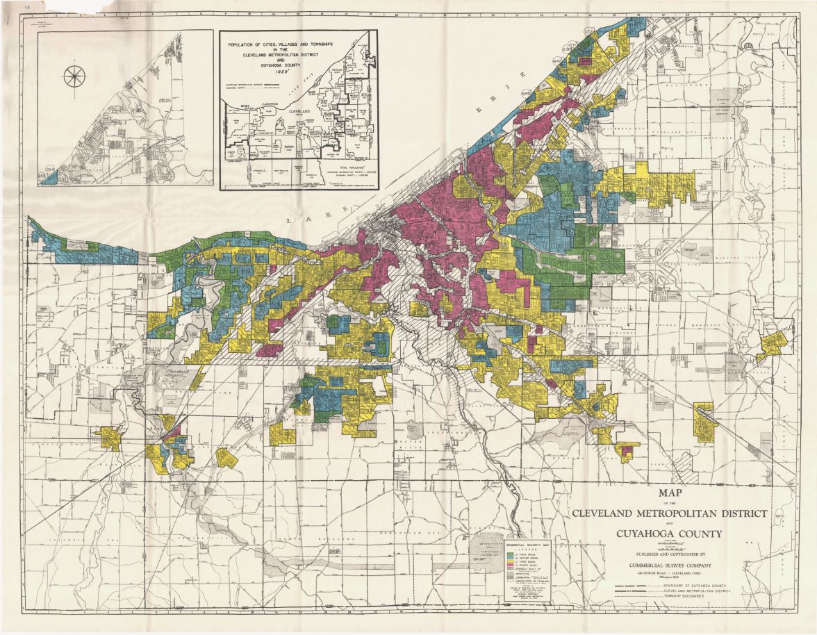
In the 1930s and 1940s, real estate agents and federal bureaucrats created 239 city maps—14 in Ohio—to gauge the riskiness of home financing. Neighborhoods were assigned security grades: the safest areas were graded A and colored green, and the riskiest areas given grade D and colored red. While these maps were tied to economic risk, one of the major factors used was race and ethnicity. The maps connected demographics to lending, such that the riskiest areas were either integrated or had large foreign-born or Black populations, while areas considered the most ideal for lending had essentially no immigrants or Black residents.
Many of the "redlined" neighborhoods were middle-class, but were considered risky investments based largely on race or ethnicity. This practice of systematically denying home loans to residents had an immediate effect on housing instability, particularly in the Black community. Many households were forced into a contract sale system that ultimately led to numerous evictions. As such, redlining set in motion decades of community disinvestment that has plagued many of these neighborhoods ever since.
Fig. 1 – Map of the Cleveland Metropolitan District and Cuyahoga County, created by the Home Owner's Loan Corporation (HOLC) in 1940

Source: The Ohio State University Libraries
Fig. 2 – Map of Columbus, Ohio, and Vicinity, created by the HOLC in 1936

Source: The Ohio State University Libraries
Studies have shown that these cycles of disinvestment have impacts that extend to today; areas redlined in the 1930s and 1940s currently have, for example, higher poverty rates. So how do these redlined areas correlate with eviction rate, an indicator of poverty? In Evicted: Poverty and Profit in the American City, Matthew Desmond writes that "eviction isn't just a condition of poverty; it's a cause of poverty." He draws connections between the likelihood of eviction and neighborhood indicators of disadvantage.
Do the areas graded worst correspond with the highest eviction rates today? Given the tie between poverty and redlining, we would expect Grade A areas would correlate with the lowest eviction rates. Using data from Desmond's Eviction Lab, we mapped eviction rates at the block group level in the parts of Cleveland and Columbus that were mapped by the HOLC to see how rates compare across the four security grades.
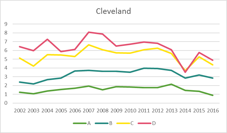
Results were surprising. In Cleveland, they followed this trend: Grade A or B areas—such as Cleveland Heights and Bay Village—had lower eviction rates (1.66 and 3.25 evictions per 100 renters, respectively). Areas with Grades C or D—such as Glenville, Broadway-Slavic Village and Clark-Fulton—had higher rates (5.41 and 6.32, respectively). This pattern demonstrates a long-lasting impact of disinvestment, which has remained consistent over the past 15 years (see Fig. 4).
Fig. 3 – Evictions per 100 Renters and HOLC Security Grades, Cleveland Area

Source: Eviction Lab, Princeton University; Kirwan Institute for the Study of Race and Ethnicity, The Ohio State University
Notes: Evictions are from 2002 to 2016
Fig. 4 – Evictions per 100 Renters by HOLC Security Grade, Cleveland Area

Source: Eviction Lab, Princeton University; Kirwan Institute for the Study of Race and Ethnicity, The Ohio State University
However, in Columbus the pattern is less clear and provides an interesting perspective on how space has been reshaped by population growth and investment. As expected, Grade A areas—such Clintonville and Bexley—had the lowest eviction rate (4.26), while Grade D areas—such as Franklinton and North Linden—had the highest rate (5.53). The results were flipped, however, for Grades B and C areas. Areas with the better Grade B—such as the Hilltop and South Linden—showed a slightly higher rate than areas with Grade C—such as Merion Village and Victorian Village. Overall, the eviction rate in Grade D areas was only 30 percent higher than the rate in Grade A areas. In 2016, the eviction rate was nearly identical across security grades (see Fig. 6). Comparatively, the eviction rate in Grade D areas in Cleveland was nearly four times (381 percent) the rate in areas with Grade A in that region.
Fig. 5 – Evictions per 100 Renters and HOLC Security Grades, Columbus Area

Source: Eviction Lab, Princeton University; Kirwan Institute for the Study of Race and Ethnicity, The Ohio State University
Notes: Evictions are from 2002 to 2016
Fig. 6 – Evictions per 100 Renters by HOLC Security Grade, Columbus Area

Source: Eviction Lab, Princeton University; Kirwan Institute for the Study of Race and Ethnicity, The Ohio State University
These results are better understood by focusing on the shifts in Columbus's housing market. The correlation between security grade and eviction rate has weakened in recent years as neighborhoods near downtown have seen reinvestment, while others further away have experienced deterioration. For example, eight decades ago, German Village was given the lowest grade and now has some of the lowest eviction rates in the urban core, while neighborhoods like Eastmoor were given the highest grade, but today experience high eviction rates.
At the same time, Cleveland has seen limited redevelopment in redlined areas, in part due to large-scale slum clearance and riots in the 1960s, but also due simply to overall population loss. Columbus was a third the size of Cleveland in 1930 but is more than twice its size today, due to gains in the former and losses in the latter.
Redlining's legacy is clearly a negative one, given its systematic disinvestment in people and neighborhoods of color, but it's complex, with its effects manifesting differently from place to place. Though some redlined areas have recovered, most have not. The redlining maps illustrate the pitfalls of making long-term economic and housing predictions based solely on stereotypes.

